Reducing Clutter Without Losing Context
4 Team Members
April - September 2025
Product Design intern

OVERVIEW
During my internship at Safe Software, I led the end-to-end redesign of the annotation experience in FME Form, a data integration platform used to build complex spatial workflows.
Annotations play a key role in helping users document logic, explain decisions, and maintain clarity across workflows. However, as workflows grow in complexity, annotations began to introduce more problems than they solved, cluttering the canvas, reducing readability, and making navigation more difficult.
the impact
The enhanced annotation feature reduced visible canvas clutter by 57%, improving workflow readability and navigation across complex workflows
Problem space
No visibility controls.
Annotations were essential for adding context, but created significant visual clutter and reduced workflow readability. Users had no way to control visibility, leading to overloaded canvases.

Problem 1.1 - no visibility control for annotations
Lack of customizability & details.
Summary annotations don't go deep enough. They describe what an object does, but not why it's configured a certain way. Users end up writing their own custom annotations just to fill in the gaps, adding friction to an already complex workflow.

Problem 1.2 - users rely on custom annotations
user workarounds
Using bookmarks to tuck annotation 😭
We also interviewed some users that often tuck annotations into bookmarks so they can collapse them and keep the workspace neat. It’s a clever workaround to cut down on clutter, but it can still feel a bit clunky, visually cluttered and don't provide any context.

Users' workaround 1.1 - using bookmarks
Solution: Reducing Clutter Through Collapsed Annotations
Right click menu as access point.
We introduced collapsible annotations to reduce visual clutter while preserving access to context. Annotations can be minimized into an icon on the object header, with controls available via right-click and the toolbar for flexible interaction.
Annotation visibility 1.1 - collapsible annotations
Side window as annotation container.
When annotations are hidden, they needed somewhere logical to go. I grouped them under a single container, keeping the canvas clean while making sure users could still navigate between them quickly without losing context.
Annotation visibility 1.2 - annotation container
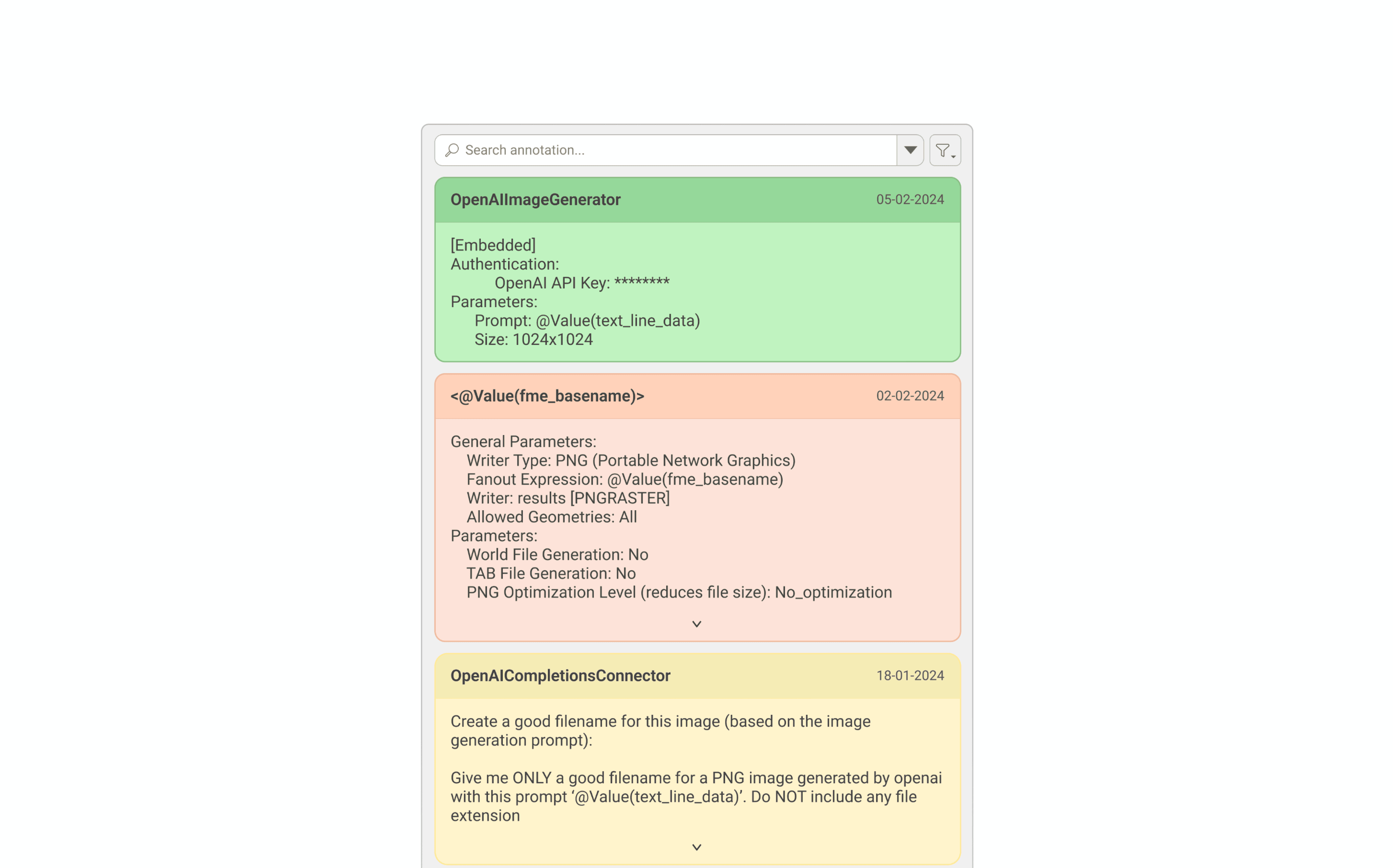
Solution: annotation IN Parameter dialog
Adding in-line annotation.
Users were constantly switching between the canvas and parameter dialogs to reference their notes. To solve this, I brought annotations directly into the dialog, so context lives right where decisions are being made.
Parameter dialog 1.1 - creating annotation
Multi-level visibility.
Annotations are accessible across the canvas, group, and navigator levels, so users can always find context no matter where they're working in a complex workflow.

Parameter dialog 1.2 - group-level

Parameter dialog 1.3 - canvas level
IMPLEMENTATION
What made to release and what didn’t.
The annotation in the parameter dialog has been released and is now available to users. However, the annotation visibility feature is on hold due to capacity constraints, though it has been prioritized for future development and remains on the Product Planning page.

Delivery 1.1 - happy ending
RETROSPECTIVE
What I learned.
Collaboration and communication is key
Worked closely with project managers, developers, and designers from the start to keep the project aligned with its goals.
Always consider having backup ideas
Maintained a bank of ideas enabled the team to adapt efficiently to any changes in project direction and facilitated smoother negotiations with developers.