Reducing Clutter Without Losing Context
4 Team Members
April - September 2025
UX Design intern

OVERVIEW
I led the end-to-end redesign of the annotation experience, cutting visible canvas clutter by 57% and improving navigation clarity.
In the winter of 2024, I joined Safe Software as a UX design intern for eight months. I was part of a team consisting of four designers, where I worked on one of their main products, the FME (Feature Manipulation Engine) Form, a data integration platform that allows its user to integrate and transform spatial data from a diverse range of formats and systems.
Context
What is annotation in FME Form.
Annotations in FME are designed to enhance the clarity and organization of workflows by allowing users to add comments or notes directly within the interface. They help provide context, instructions, or explanations for specific parts of a workflow, making it easier to understand complex processes.
Annotations can be classified into two types:
Created manually by users
Users have control over the contents
Generated by the software
Contents are predefined

Problem space
Lack of customizability & details.
Summary annotations often lack sufficient detail to explain specific attributes or logic within the parameter dialog. Consequently, users must add custom annotations to provide more comprehensive explanations.

Problem 1.1 - users rely on custom annotations
No visibility controls.
Annotations placed on the canvas remain visible permanently and can only be removed by deleting them.

Problem 1.2 - no visibility control for annotations
user study
What the FME Community told us.
To refine our hypothesis and potential solutions, we conducted in-depth research on user needs and pain points through feedback from the FME Community platform, where users expressed a strong desire for annotations to be collapsible and to also exist within the parameter dialog to keep important notes visible at the point of configuration.

User input 1.1 - inline annotation & visibility controls
Using bookmarks to tuck annotation 😭
We also interviewed some users that often tuck annotations into bookmarks so they can collapse them and keep the workspace neat. It’s a clever workaround to cut down on clutter, but it can still feel a bit clunky, visually cluttered and don't provide any context.

Users' workaround 1.1 - using bookmarks
POTENTIAL SOLUTIONS
Creating a more comprehensive annotations.
Following our hypothesis on the problem space, the team identified three potential solutions.
Allow users to toggle annotations between expanded and minimized states.
Allow users to embed notes within parameter editor dialogs, where they are defining logic, and making decisions that impact the outcomes.
proeject kickoff - Audit
Finding the right home for collapsed annotations indicator.
We audited the current canvas object layout to determine where a collapsed annotation could sit without interfering with other elements. We identified the right side of the object header as the only viable location, since the left side is already dedicated to alert and warning indicators.

Audit 1.1 - collapsed annotation icon location in canvas object
Intuitive placement within parameter workflows.
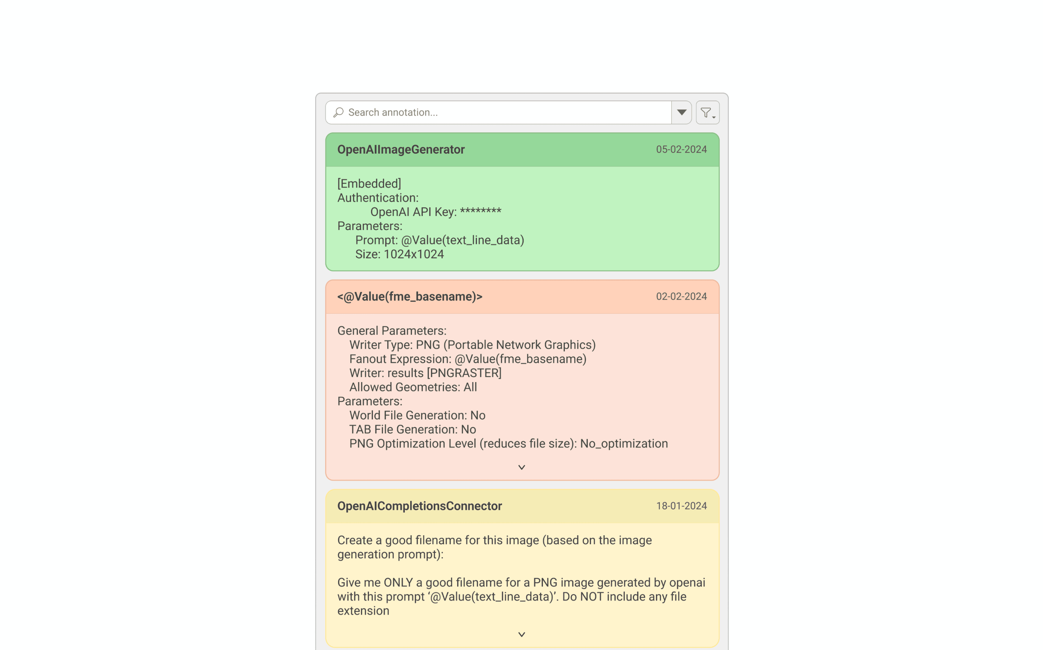
To ensure annotations in parameter dialogs felt natural and didn’t disrupt existing workflows, we placed the annotation option within the existing dropdown area, where users can define parameter logic and adjust parameter properties.

Audit 1.2 - dropdown in dialogs
Shaping annotation visibility controls
Icon indicator.
We followed the same annotation icon used in the toolbar so users can easily recognize it and associate it with annotations, keeping the interface consistent and familiar.

Shaping 1.1 - icon indicator
Right click menu as access point.
We introduced collapsible annotations to reduce visual clutter while preserving access to context. Annotations can be minimized into an icon on the object header, with controls available via right-click and the toolbar for flexible interaction.
Annotation visibility 1.1 - collapsible annotations
Side window as annotation container.
When annotations are hidden, they needed somewhere logical to go. I grouped them under a single container, keeping the canvas clean while making sure users could still navigate between them quickly without losing context.
Annotation visibility 1.2 - annotation container
Shaping annotation IN Parameter dialog
Adding in-line annotation.
Users were constantly switching between the canvas and parameter dialogs to reference their notes. To solve this, I brought annotations directly into the dialog, so context lives right where decisions are being made.
Shaping 2.1 - creating annotation
Getting buy-ins
Design evaluation & stakeholder feedback.
To evaluate our design and uncover potential pain points, we used storyboarding to walk PMs and engineers through the proposed flow and interactions, which helped us in gathering feedback& opportunities to improve the overall flow or design.

Getting buy-ins 1.1 - storyboarding & interactive prototypes
Iteration
Showing annotation on a different level.
After discussions with stakeholders, we identified that annotations inside the parameter dialog weren't getting enough visibility. We explored surfacing them at both the group and canvas levels using icons and formatted text as indicators, and brought them into the navigator so users could locate annotations quickly without digging through the canvas.


USABILITY TESTING
Final leg!
To evaluate our design and uncover pain points, we ran qualitative usability tests with four customer success team members experienced in FME Workbench. Using detailed test plans and an interactive prototype, we gathered feedback on usability and functionality.

Usability testing 1.1 - internal test
Participants completed 96% of the required tasks and indicated that the feature would provide meaningful value by improving users’ workflow.
IMPLEMENTATION
What made to release and what didn’t.
The annotation in the parameter dialog has been released and is now available to users. However, the annotation visibility feature is on hold due to capacity constraints, though it has been prioritized for future development and remains on the Product Planning page.

Delivery 1.1 - happy ending
RETROSPECTIVE
What I learned.
Collaboration and communication is key
Worked closely with project managers, developers, and designers from the start to keep the project aligned with its goals.
Always consider having backup ideas
Maintained a bank of ideas enabled the team to adapt efficiently to any changes in project direction and facilitated smoother negotiations with developers.