The Design System That Kept AMD's Team Aligned
3 Team Members
May - October 2025
Design System Guy
Overview
During my internship with AMD’s User Experience team, I helped shape the design system that unifies the look, feel, and behavior of AMD’s digital products. From designing interactive prototypes to refining component behaviors and documenting patterns, I worked to create a system that empowers designers and developers to build cohesive experiences with clarity and efficiency.
During my internship with AMD’s User Experience team, I helped shape the design system that unifies the look, feel, and behavior of AMD’s digital products. From designing interactive prototypes to refining component behaviors and documenting patterns, I worked to create a system that empowers designers and developers to build cohesive experiences with clarity and efficiency.
HIGHLIGHT
I built a scalable design system foundation to support AMD Software’s next-generation redesign and ensure long-term consistency across products.
I built a scalable design system foundation to support AMD Software’s next-generation redesign and ensure long-term consistency across products.


Context
Laying the groundwork for change.
When I first joined the team, there wasn’t a proper design system in place. Designers organized files in different ways, assets were scattered across projects, and the product often felt like it was assembled piece by piece rather than guided by a shared structure.
When I first joined the team, there wasn’t a proper design system in place. Designers organized files in different ways, assets were scattered across projects, and the product often felt like it was assembled piece by piece rather than guided by a shared structure.

Context 1.1 - problem overview
Turning a transition into opportunity.
At the same time, the team was preparing for a complete redesign of the software. Without a consistent system, scaling the redesign would be difficult, but it also created an opportunity to rethink how components, styles, and assets were organized so the new interface could be built on a stronger foundation.
At the same time, the team was preparing for a complete redesign of the software. Without a consistent system, scaling the redesign would be difficult, but it also created an opportunity to rethink how components, styles, and assets were organized so the new interface could be built on a stronger foundation.

Context 1.2 - a new fresh start
GOAL
With a clear direction established, I outlined several goals that the design system would need to support, such as:
With a clear direction established, I outlined several goals that the design system would need to support, such as:
Establish a clear and consistent design foundation.
Create a unified design system that organizes assets, standardizes components, and brings consistency to the current AMD Software experience.
Create a unified design system that organizes assets, standardizes components, and brings consistency to the current AMD Software experience.
Improve design-to-development handover efficiency.
Create a scalable system that streamlines collaboration and ensures faster, more consistent design-to-development handover for the current AMD Software.
Create a scalable system that streamlines collaboration and ensures faster, more consistent design-to-development handover for the current AMD Software.
Support future initiative with a scalable system.
Build a future-focused design system that serves as the foundation for the upcoming rework of AMD Software, ensuring designers and developers can collaborate efficiently as the product evolves.
High-level audit on previous design system
Color mismatch.
I discovered major inconsistencies in how colors were used across the product. Without clear guidelines, teams applied colors differently depending on their interpretation, leading to unclear states, mismatched styles, and a lack of visual hierarchy
I discovered major inconsistencies in how colors were used across the product. Without clear guidelines, teams applied colors differently depending on their interpretation, leading to unclear states, mismatched styles, and a lack of visual hierarchy

Lessons 1.1 - color mismatch
Styling gaps.
I also found significant inconsistencies in component styling, one example is with buttons. Different screens used different sizes, corner radiuses, spacings, and even interaction states.
I also found significant inconsistencies in component styling, one example is with buttons. Different screens used different sizes, corner radiuses, spacings, and even interaction states.

Lessons 1.2 - styling gaps
DESIGN FOUNDATIONS
Instead of patching these inconsistencies one by one, I stepped back to understand the deeper pattern behind them. This shift in perspective allowed me to move beyond surface-level fixes and focus on building a more intentional, system-driven solution.
Instead of patching these inconsistencies one by one, I stepped back to understand the deeper pattern behind them. This shift in perspective allowed me to move beyond surface-level fixes and focus on building a more intentional, system-driven solution.
The push for a better color foundation.
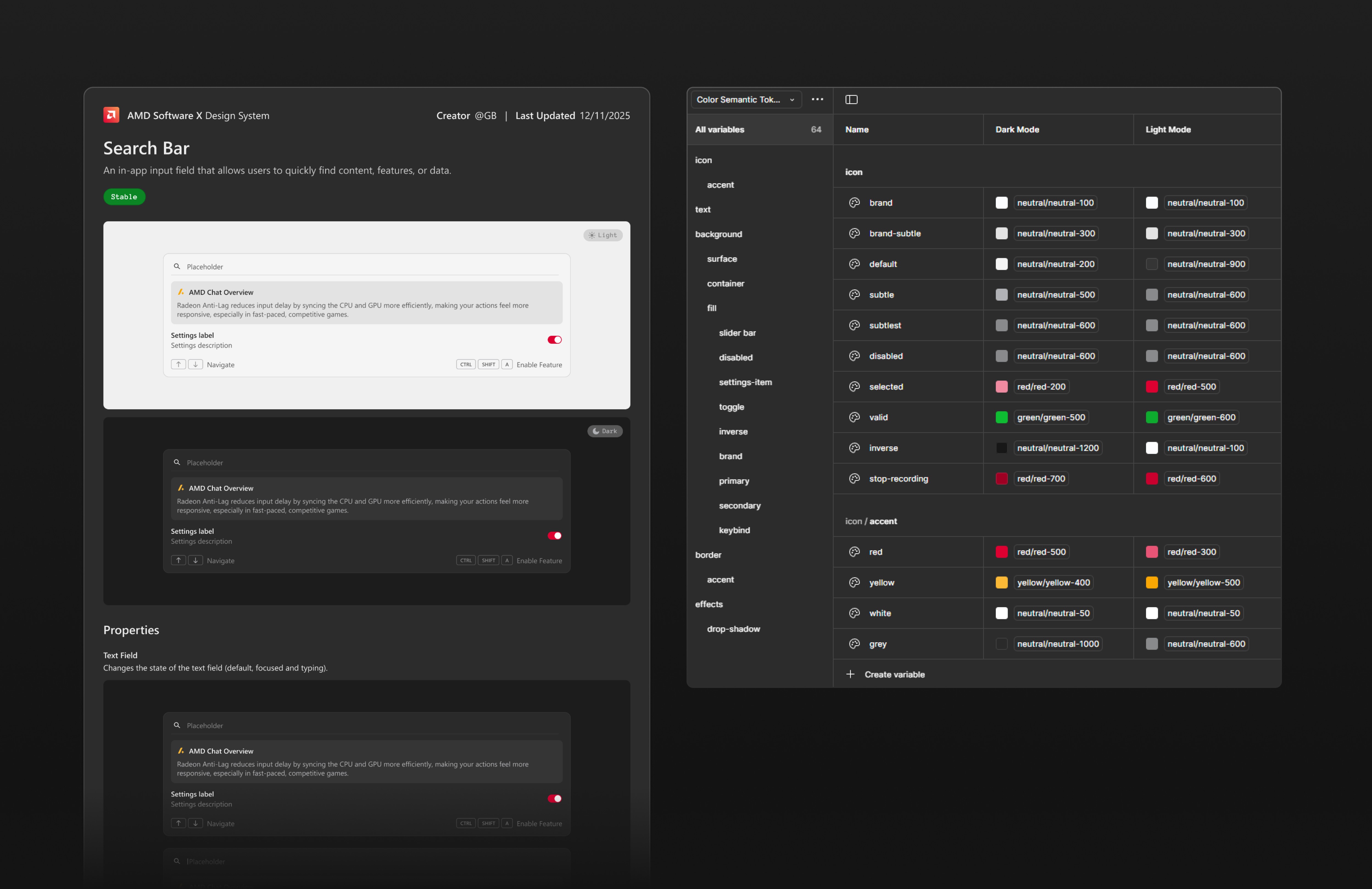
To keep the design system flexible, I defined primitive tokens as the base color palette and used semantic tokens to apply those colors throughout the components. This allowed components to rely on intent-driven values rather than fixed hex codes.
To keep the design system flexible, I defined primitive tokens as the base color palette and used semantic tokens to apply those colors throughout the components. This allowed components to rely on intent-driven values rather than fixed hex codes.

Updates 1.1 - primitive tokens
Once the primitives were set, I mapped them to semantic tokens named by purpose or state. This ensured components always referenced meaningful, role-based tokens, which made updates much smoother and more consistent.
Once the primitives were set, I mapped them to semantic tokens named by purpose or state. This ensured components always referenced meaningful, role-based tokens, which made updates much smoother and more consistent.

Update 1.2 - semantic tokens
A proper spacing & radius tokens.
To bring consistency to layouts, I introduced numeric tokens for spacing and radius based on a structured 4-point scale. By defining a predictable set of spacing and radius tokens, layout decisions became clearer, adjustments were safer to make.
To bring consistency to layouts, I introduced numeric tokens for spacing and radius based on a structured 4-point scale. By defining a predictable set of spacing and radius tokens, layout decisions became clearer, adjustments were safer to make.

Update 1.3 - structured spacing & radius tokens,
Streamlined text styling.
Text styles were inconsistent across different parts of the product, with each feature using its own font sizes and line heights. I simplified this by consolidating everything into a single, structured typography scale with clear header and body levels.
Text styles were inconsistent across different parts of the product, with each feature using its own font sizes and line heights. I simplified this by consolidating everything into a single, structured typography scale with clear header and body levels.

Update 1.4 - streamlined text-style
BUILDING THE COMPONENTS
Identifying common components.
As we explored different design styles, I started building the foundational components of the design system, beginning with essentials like buttons.
As we explored different design styles, I started building the foundational components of the design system, beginning with essentials like buttons.

Building 1.1 - dissecting the designs
Dissecting the designs.
As the project progressed and designs began receiving approval from stakeholders, I gradually expanded the design system to include additional UI patterns and refined them further. Complex UI components often need to be further broken down to improve flexibility and maintainability.
As the project progressed and designs began receiving approval from stakeholders, I gradually expanded the design system to include additional UI patterns and refined them further. Complex UI components often need to be further broken down to improve flexibility and maintainability.

Building 1.2 - dissecting the designs
Applying proper color structure.
With the help of pre-defined color tokens, I could easily assign colors to components according to their semantic role. This not only sped up the design process but also ensured consistency across the system.
With the help of pre-defined color tokens, I could easily assign colors to components according to their semantic role. This not only sped up the design process but also ensured consistency across the system.

Building 1.3 - proper color structure
Applying foundational design tokens.
Foundational design tokens define core properties such as spacing, radius, and typography. By applying these tokens consistently across components, designers can maintain visual consistency while making updates easier to scale.
Foundational design tokens define core properties such as spacing, radius, and typography. By applying these tokens consistently across components, designers can maintain visual consistency while making updates easier to scale.

Building 1.4 - applying design tokens
Supporting multiple variants.
Instead of creating endless variants that would complicate the system, I chose to use the slot method. By treating slots as flexible placeholders, I gave the components room to adapt their content while still maintaining a consistent and polished appearance.
Instead of creating endless variants that would complicate the system, I chose to use the slot method. By treating slots as flexible placeholders, I gave the components room to adapt their content while still maintaining a consistent and polished appearance.

Building 1.5 - slot method
dOCUMENTATION
Reducing communication gaps between designers and developers.
Reducing communication gaps between designers and developers.
To solve back-and forth communication between design and development, I created guidelines that outline each component’s behavior and variants so designers and developers know exactly how things should work without the guesswork.
To solve back-and forth communication between design and development, I created guidelines that outline each component’s behavior and variants so designers and developers know exactly how things should work without the guesswork.

Guideline 1.1 - UI components behavior guideline

Guideline 1.2 - usage guideline
IMPACT
Consistent & maintainable mockups.
Once we started using system assets, things just felt more consistent. For example, colors were unified and the number of random hex codes floating around dropped way down. It also made our mockups so much easier to maintain, since updates could be applied quickly and carried across all designs without extra work.
Once we started using system assets, things just felt more consistent. For example, colors were unified and the number of random hex codes floating around dropped way down. It also made our mockups so much easier to maintain, since updates could be applied quickly and carried across all designs without extra work.

Impact 1.1 - consistent color usage
Impact 1.2 - same vibess across assets
No more guess works.
Additionally, with pre-defined values, designers no longer have to guess values like spacing & radius. It is as easy as picking from a set menu! This not only sped up decision-making but also gave every screen a cohesive rhythm and flow.
Additionally, with pre-defined values, designers no longer have to guess values like spacing & radius. It is as easy as picking from a set menu! This not only sped up decision-making but also gave every screen a cohesive rhythm and flow.

Impact 1.3 - consistent radius & spacing
THE NEXT STEP
Proposing documentation using Supernova.
The next step is to create the documentation in Supernova, as it transforms the design system from static Figma files into a living, developer-ready source of truth. Supernova automatically syncs design tokens, components, and guidelines while generating platform-specific code and versioned documentation.
The next step is to create the documentation in Supernova, as it transforms the design system from static Figma files into a living, developer-ready source of truth. Supernova automatically syncs design tokens, components, and guidelines while generating platform-specific code and versioned documentation.

RETROSPECTIVE
What I learned.
Take Initiative!
Being initiative means taking action without waiting, spotting opportunities, proposing solutions, and new ideas forward to help the team succeed.
Take Initiative!
Being initiative means taking action without waiting, spotting opportunities, proposing solutions, and new ideas forward to help the team succeed.
Extra Work Pays Off
Putting more efforts in the beginning of the development will benefit the team in the long run - stronger design quality, fewer downstream issues, and a far more efficient workflow for the entire team.
Extra Work Pays Off
Putting more efforts in the beginning of the development will benefit the team in the long run - stronger design quality, fewer downstream issues, and a far more efficient workflow for the entire team.
Overview
During my internship with AMD’s User Experience team, I helped shape the design system that unifies the look, feel, and behavior of AMD’s digital products. From designing interactive prototypes to refining component behaviors and documenting patterns, I worked to create a system that empowers designers and developers to build cohesive experiences with clarity and efficiency.
HIGHLIGHT
I built a scalable design system foundation to support AMD Software’s next-generation redesign and ensure long-term consistency across products.
Context
Laying the groundwork for change.
When I first joined the team, there wasn’t a proper design system in place. Designers organized files in different ways, assets were scattered across projects, and the product often felt like it was assembled piece by piece rather than guided by a shared structure.
Context 1.1 - problem overview
Context 1.1 - problem overview
Turning a transition into opportunity.
At the same time, the team was preparing for a complete redesign of the software. Without a consistent system, scaling the redesign would be difficult, but it also created an opportunity to rethink how components, styles, and assets were organized so the new interface could be built on a stronger foundation.
Context 1.2 - a new fresh start
GOAL
With a clear direction established, I outlined several goals that the design system would need to support, such as:
Establish a clear and consistent design foundation.
Create a unified design system that organizes assets, standardizes components, and brings consistency to the current AMD Software experience.
Improve design-to-development handover efficiency.
Create a scalable system that streamlines collaboration and ensures faster, more consistent design-to-development handover for the current AMD Software.
Support future initiative with a scalable system.
Build a future-focused design system that serves as the foundation for the upcoming rework of AMD Software, ensuring designers and developers can collaborate efficiently as the product evolves.
High-level audit
Before diving into creating new assets, I wanted to make sure we were solving the right problem at the foundation level. And the main problems were…
Color mismatch.
I discovered major inconsistencies in how colors were used across the product. Without clear guidelines, teams applied colors differently depending on their interpretation, leading to unclear states, mismatched styles, and a lack of visual hierarchy
Lessons 1.1 - color mismatch
Lessons 1.1 - color mismatch
Styling gaps.
I also found significant inconsistencies in component styling, one example is with buttons. Different screens used different sizes, corner radiuses, spacings, and even interaction states.
Lessons 1.2 - styling gaps
Lessons 1.2 - styling gaps
DESIGN FOUNDATIONS
Instead of patching these inconsistencies one by one, I stepped back to understand the deeper pattern behind them. This shift in perspective allowed me to move beyond surface-level fixes and focus on building a more intentional, system-driven solution.
The push for a better color foundation.
To keep the design system flexible, I defined primitive tokens as the base color palette and used semantic tokens to apply those colors throughout the components. This allowed components to rely on intent-driven values rather than fixed hex codes.
Updates 1.1 - primitive tokens
Updates 1.1 - primitive tokens
Once the primitives were set, I mapped them to semantic tokens named by purpose or state. This ensured components always referenced meaningful, role-based tokens, which made updates much smoother and more consistent.
Update 1.2 - semantic tokens
Update 1.2 - semantic tokens
A proper spacing & radius tokens.
To bring consistency to layouts, I introduced numeric tokens for spacing and radius based on a structured 4-point scale. By defining a predictable set of spacing and radius tokens, layout decisions became clearer, adjustments were safer to make.
Update 1.3 - structured spacing & radius tokens,
Update 1.3 - structured spacing & radius tokens,
Streamlined text styling.
Text styles were inconsistent across different parts of the product, with each feature using its own font sizes and line heights. I simplified this by consolidating everything into a single, structured typography scale with clear header and body levels.
Update 1.4 - streamlined text-style
Update 1.4 - streamlined text-style
BUILDING THE COMPONENTS
Identifying common components.
As we explored different design styles, I started building the foundational components of the design system, beginning with essentials like buttons.
Building 2.1 - dissecting the designs
Building 2.1 - dissecting the designs
Dissecting the designs.
As the project progressed and designs began receiving approval from stakeholders, I gradually expanded the design system to include additional UI patterns and refined them further. Complex UI components often need to be further broken down to improve flexibility and maintainability.
Building 2.1 - dissecting the designs
Building 2.1 - dissecting the designs
Applying proper color structure.
With the help of pre-defined color tokens, I could easily assign colors to components according to their semantic role. This not only sped up the design process but also ensured consistency across the system.
Building 2.2 - proper color structure
Building 2.2 - proper color structure
Applying foundational design tokens.
Foundational design tokens define core properties such as spacing, radius, and typography. By applying these tokens consistently across components, designers can maintain visual consistency while making updates easier to scale.
Building 2.3 - applying design tokens
Building 2.3 - applying design tokens
Supporting multiple variants.
Instead of creating endless variants that would complicate the system, I chose to use the slot method. By treating slots as flexible placeholders, I gave the components room to adapt their content while still maintaining a consistent and polished appearance.
Building 2.4 - slot method
Building 2.4 - slot method
dOCUMENTATION
Reducing communication gaps between designers and developers.
Reducing communication gaps between designers and developers.
To solve back-and forth communication between design and development, I created guidelines that outline each component’s behavior and variants so designers and developers know exactly how things should work without the guesswork.
Guideline 1.1 - UI components behavior guideline
Guideline 1.1 - UI components behavior guideline
Guideline 1.2 - usage guideline
Guideline 1.2 - usage guideline
IMPACT
Consistent & maintainable mockups.
Consistent & maintainable mockups.
Once we started using system assets, things just felt more consistent. For example, colors were unified and the number of random hex codes floating around dropped way down. It also made our mockups so much easier to maintain, since updates could be applied quickly and carried across all designs without extra work.
Impact 1.1 - consistent color usage
Impact 1.1 - consistent color usage
Impact 1.2 - same vibess across assets
No more guess works.
No more guess works.
Additionally, with pre-defined values, designers no longer have to guess values like spacing & radius. It is as easy as picking from a set menu! This not only sped up decision-making but also gave every screen a cohesive rhythm and flow.
Impact 1.3 - consistent radius & spacing
THE NEXT STEP
Proposing documentation using Supernova.
The next step is to create the documentation in Supernova, as it transforms the design system from static Figma files into a living, developer-ready source of truth. Supernova automatically syncs design tokens, components, and guidelines while generating platform-specific code and versioned documentation.
It also includes an AI assistant that allows internal team members to ask questions about components or usage, making it easier to discover, and understand the design system.
RETROSPECTIVE
What I learned.
Take Initiative!
Being initiative means taking action without waiting, spotting opportunities, proposing solutions, and new ideas forward to help the team succeed.
Extra Work Pays Off
Putting more efforts in the beginning of the development will benefit the team in the long run - stronger design quality, fewer downstream issues, and a far more efficient workflow for the entire team.
THE NEXT STEP
Proposing documentation using Supernova.
Proposing documentation using Supernova.
The next step is to create the documentation in Supernova, as it transforms the design system from static Figma files into a living, developer-ready source of truth. Supernova automatically syncs design tokens, components, and guidelines while generating platform-specific code and versioned documentation.
It also includes an AI assistant that allows internal team members to ask questions about components or usage, making it easier to discover, and understand the design system.